03 — CARE WELLNESS SUITE · SEP 2022 – NOV 2024 · B2B2C HEALTH · ENTERPRISE DATA
From zero to 70% adoption — then I made the data sell itself
Role
Lead Product Designer & Researcher
Client
Care × Raffles Medical Group
Timeline
Sep 2022 – Nov 2024
Care, with Raffles Medical Group, entered the corporate wellness market from zero. As lead designer over ~2.5 years I owned the whole suite — the employee app that drove 70% adoption across 3,000 staff, the admin builders that let HR run programs self-serve, and the analytics layer that turned the resulting data into six-figure commercial value.
70%
adoption · 3,000 staff · 7 months
1
partner signed from a prototype, pre-code
6-fig
commercial value, sales-validated
3
connected surfaces: app · admin · analytics
The shape of the work — one loop
Employee App
WELLNESS ZONE
70% Adoption
3,000 STAFF
Engagement Data
TRAPPED, UNUSED
Analytics Layer
HR DASHBOARD
HR Acts · Sales Sells
SIX-FIGURE VALUE
↺ new partners → more employees on the app → the loop turns again
WHAT I DID
Led product design across the full Care wellness suite over ~2.5 years — the employee app, the corporate HR admin tools, and the analytics dashboard — as lead designer.
Ran UX research with Corporate HR teams and employees from existing Care partners; synthesised into affinity maps that confirmed the B2B2C model and shaped the core engagement mechanic.
Designed the gamification framework from first principles — a dual-loop points system where employees earn through wellness activities and redeem through corporate perks.
Redesigned the information architecture so Wellness Zone integrated cleanly alongside medical records and the marketplace, without disrupting the established user model.
Facilitated co-creation pitch sessions that signed the first corporate partner in August 2023 — from a prototype, before any production code.
Designed the analytics layer (Benefits / Health Report / Wellness) bridging Figma and Power BI, which the sales team adopted for B2B prospecting — validating six-figure commercial value.
The Engine — making employees actually use it
The Challenge
Build a corporate wellness platform from zero — validate the model, sign the first partner, and ship something employees engage with.
01
Winning the B2B2C conviction debate
B2C consumer app or B2B2C corporate-employer-employee? Research with existing partners confirmed B2B2C — employers were the activation layer, not individual motivation.
02
Partnership acquisition from zero
No existing user base when we needed the first corporate partner. Prototypes had to be convincing enough to sell a future state, not just demo a current product.
03
IA complexity across two user types
Wellness Zone had to integrate into the existing Care app alongside medical records and marketplace — without confusing employees already using those features.
UX Research — Jan 2023
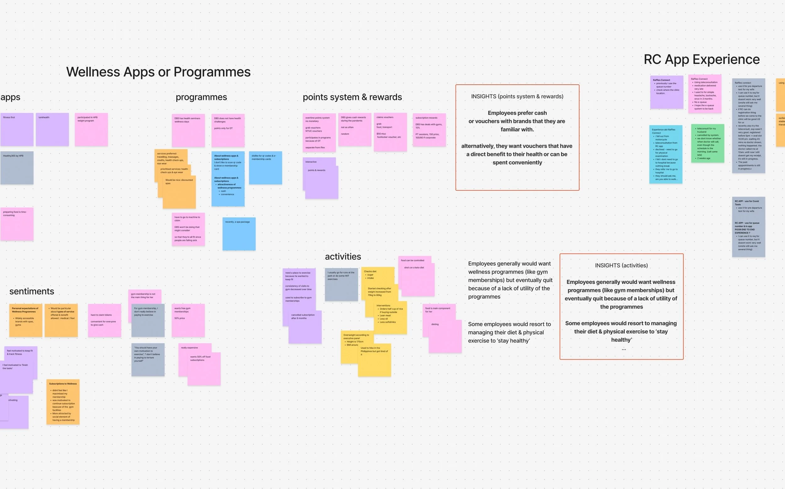
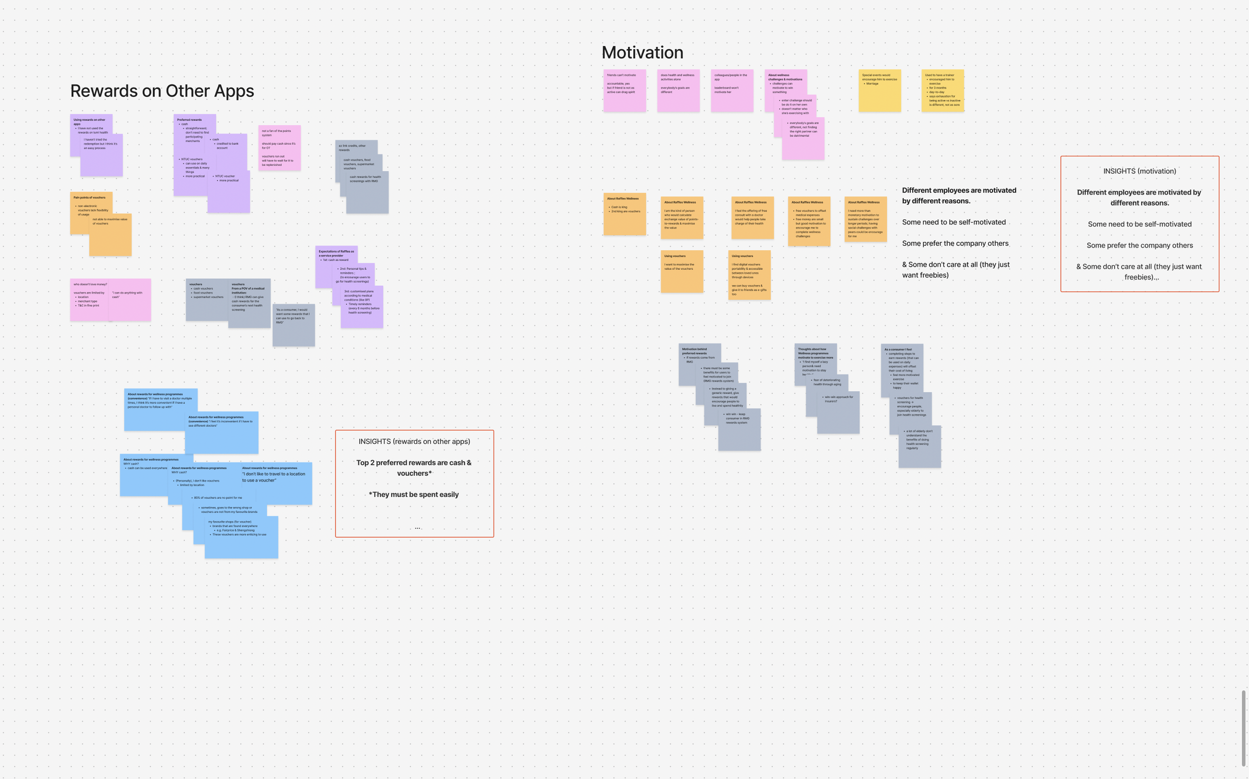
Multiple rounds of interviews across Corporate HR teams and employees from existing Care partners, synthesised into affinity maps that shaped the core product model. The research confirmed the B2B2C bet: employer-driven adoption and financial incentives consistently outperformed individual motivation.
Key research findings
Financial incentives are the activation layer
Employees engaged consistently when wellness activity translated to tangible rewards — points, discounts, cash equivalents. Social motivation alone was not sufficient.
Corporate structure drives adoption
The employer relationship was the strongest predictor of engagement. Company-wide challenges and HR-driven programs outperformed individually promoted content. B2B2C was right.
Points clarity was a trust signal
Users flagged confusion about how points were earned and spent. A clear points wallet with earn/redeem/expire history was the prerequisite for gamification to work.
Stakeholder Alignment + Information Architecture
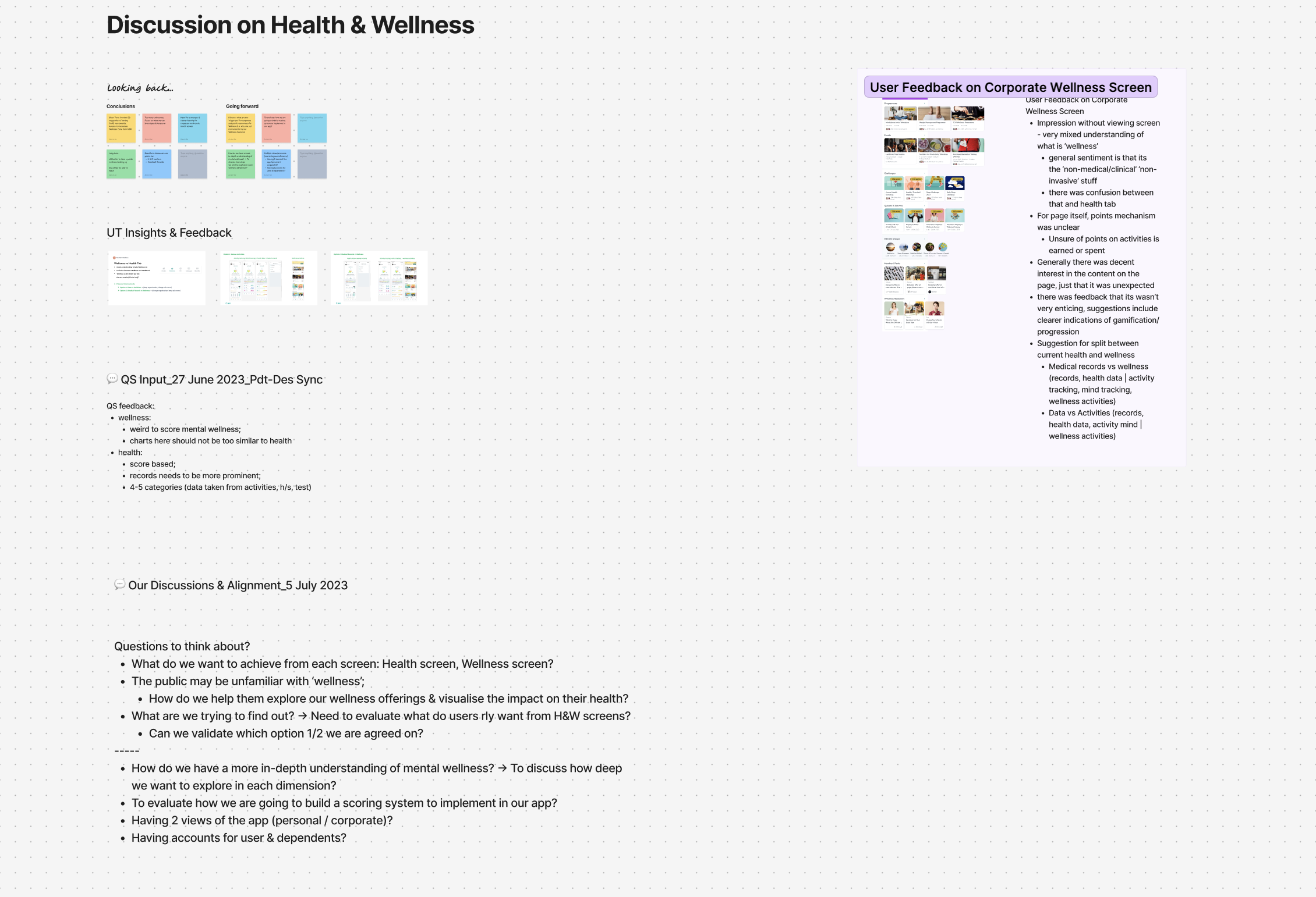
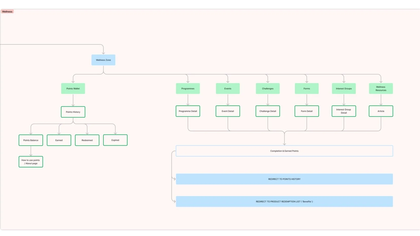
As testing surfaced conflicting signals — wellness vs. health, personal vs. corporate, scoring vs. activity-based engagement — I facilitated alignment workshops with Product, Design and CPO to resolve open questions before they became scope debt. Those outputs shaped the IA: a sitemap giving Wellness Zone a coherent sub-architecture (Points Wallet, Programmes, Events, Challenges, Forms, Interest Groups, Resources) while preserving the top-level model existing users already knew.
Prototyping — pitch before ship
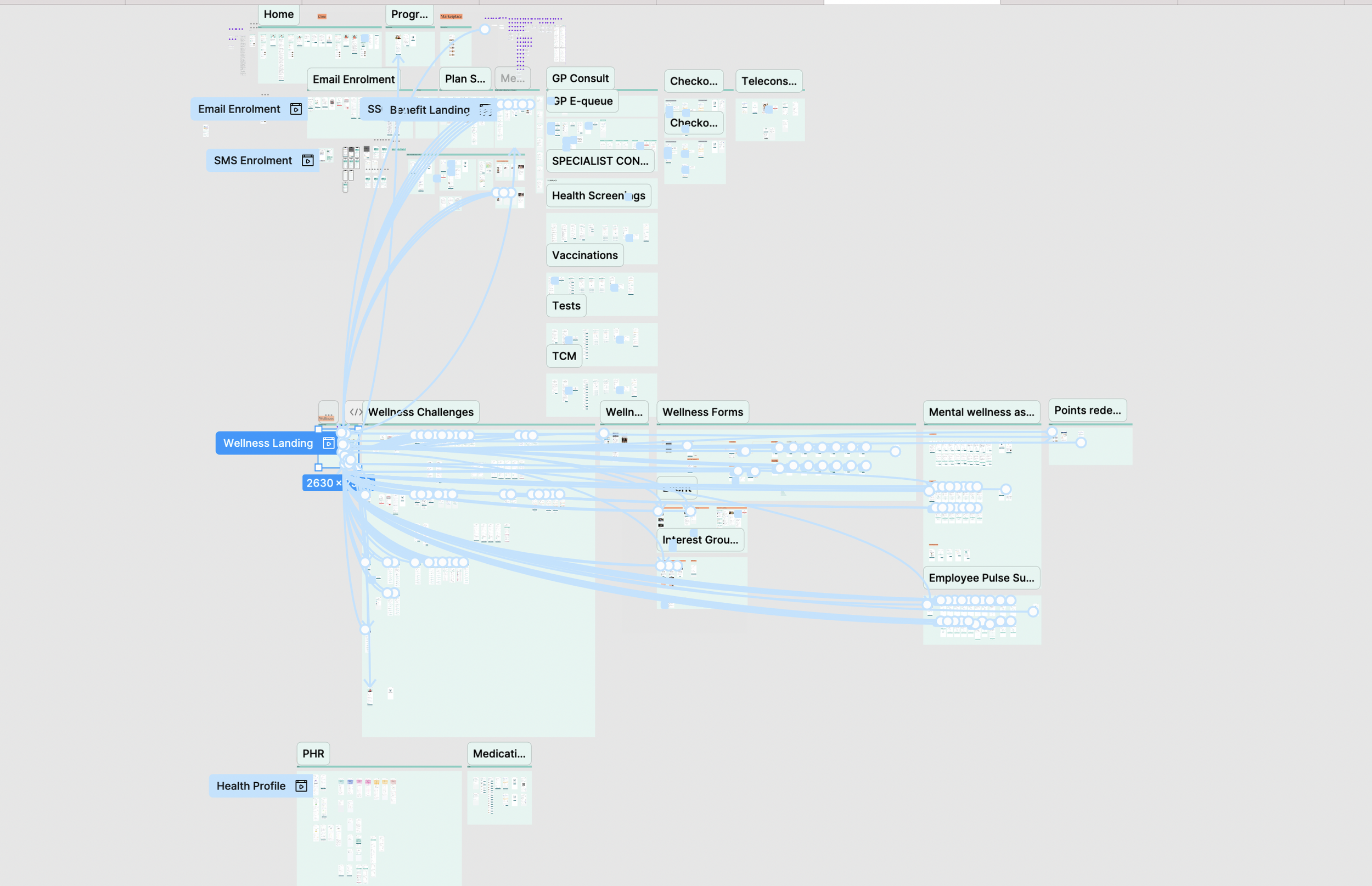
I facilitated co-creation sessions with C-suite, corporate sales and partner teams to build pitch prototypes that had to sell a future-state product. The Figma prototype map below covers the full Wellness Landing flow — enrolment, all wellness features, health profile, points redemption — built before a single line of production code. The first corporate partner was signed from this prototype in August 2023.
The Product — two surfaces
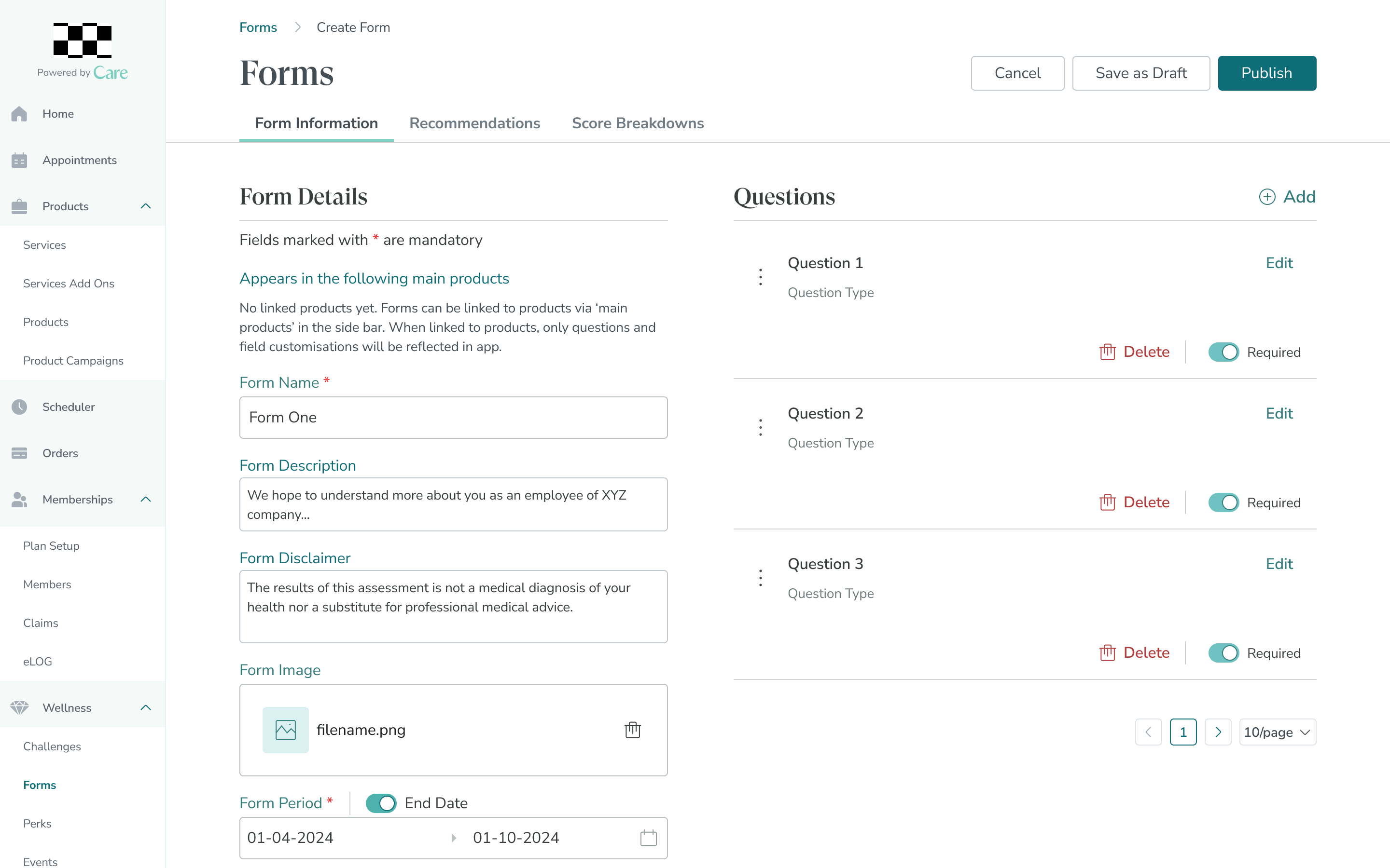
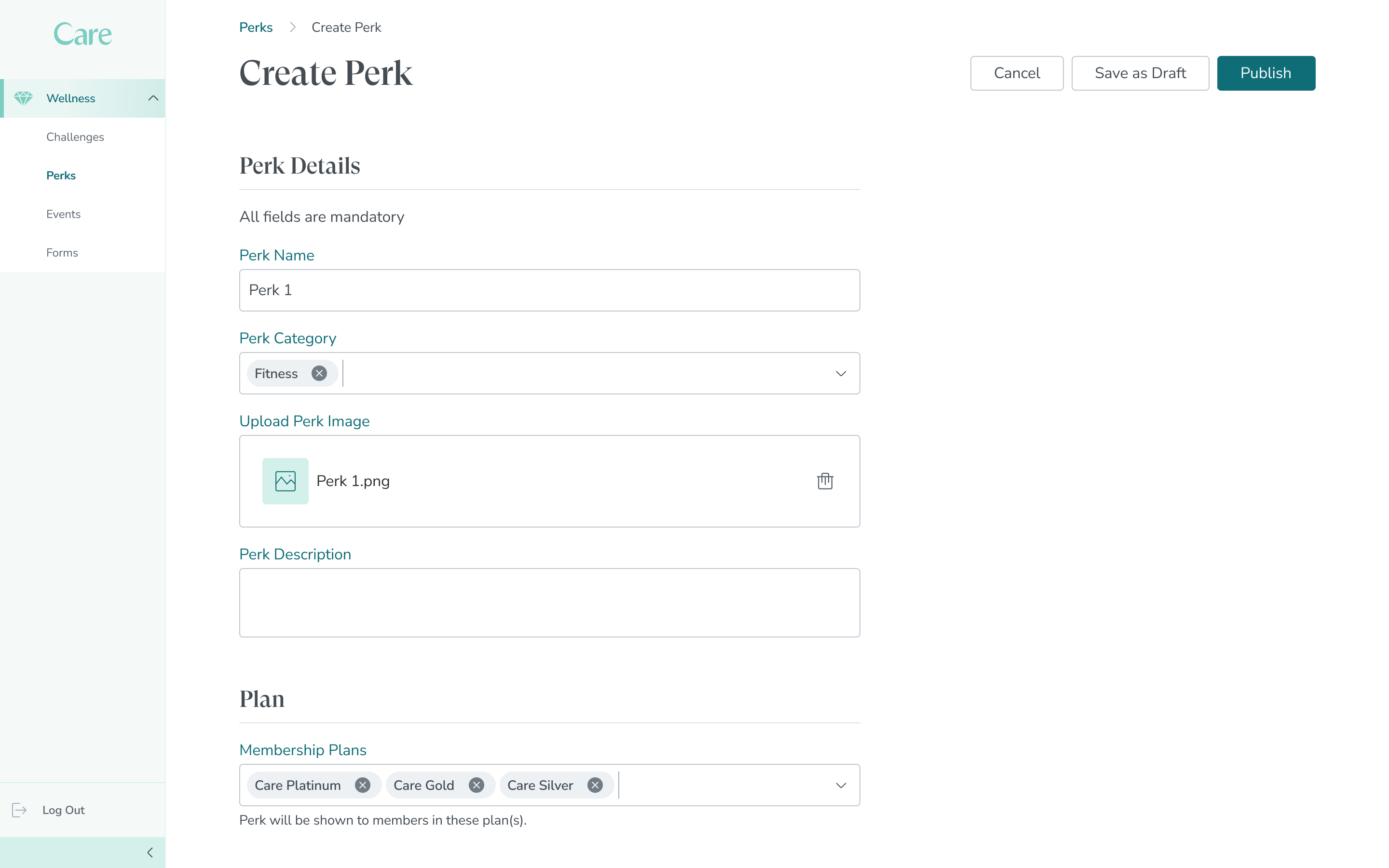
The employee app: personalised wellness challenges, a dual-loop points system, events and communities, wellness forms, and health content. Onboarding tooltips for the April 2024 launch drove the adoption spike. Alongside it, the operational admin layer — Form Builder and Perk Builder — let Corporate HR create and publish programs without engineering support (distinct from the analytics dashboard in Act 2).
The engine works — Apr–Nov 2024
employee adoption across 3,000 staff during the 7-month POC validation period (Apr–Nov 2024)
sustained monthly active usage on Wellness Zone · 4.5 / 5 CSAT from 300 participants
signed Aug 2023 — from a prototype pitch, before any production code existed
◆ The hinge
Adoption created something new: data. Thousands of employees generating engagement, health and redemption signals every day — trapped across disconnected systems. HR couldn’t act on it. Sales couldn’t sell with it. So I designed the layer that closed the loop.
The Payoff — making the data work
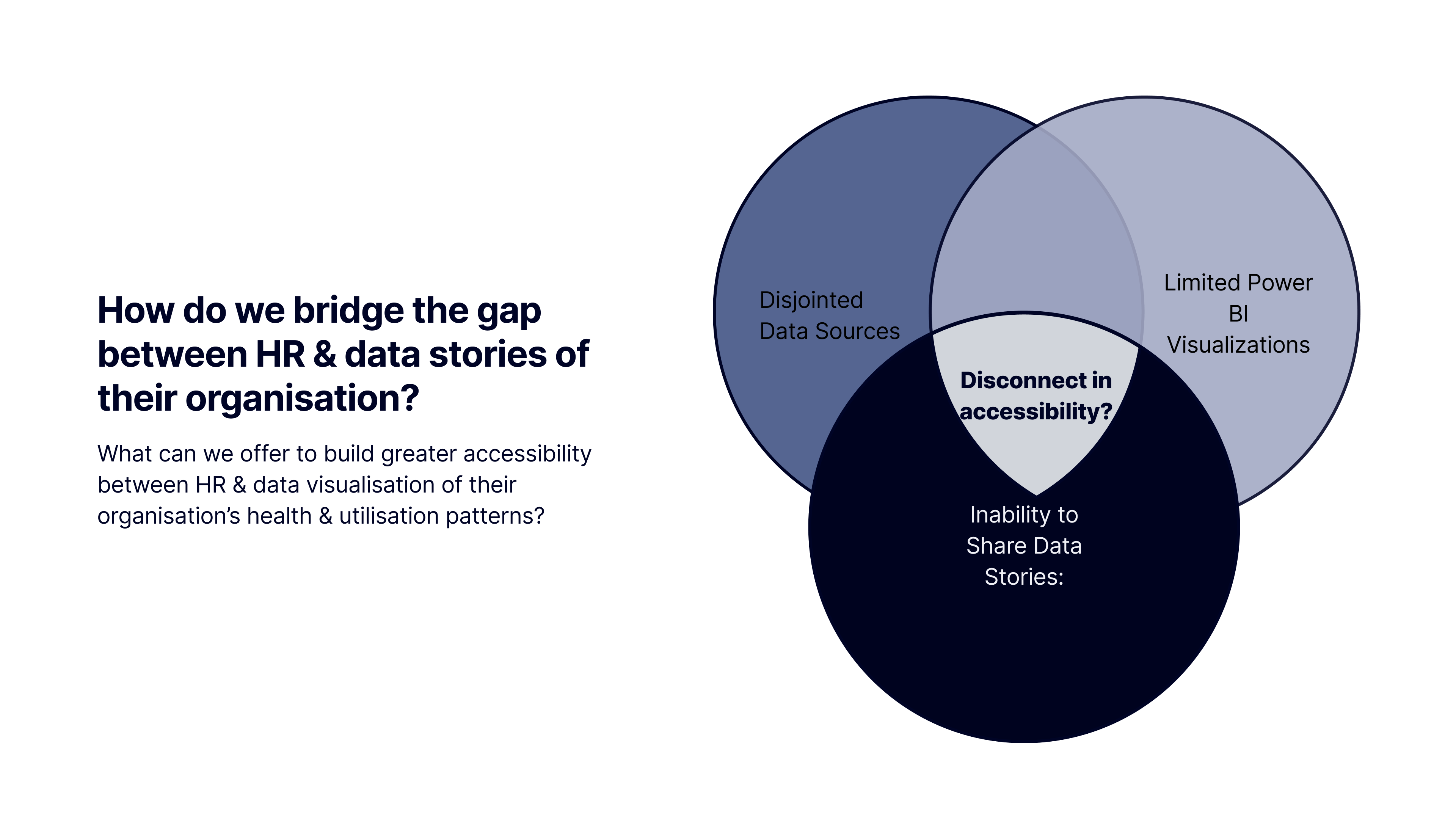
The Challenge · May–Aug 2024
Bridge the gap between HR, stakeholders, and disjointed data stories about their organisation.
HR and senior stakeholders worked from disconnected sources — no shared view, no common visual language, no way to argue for wellness investment with hard numbers. An added constraint: the data-viz layer lived in Power BI, not Figma — a cross-tool design-system challenge most processes don’t plan for.
What was built — three dashboard sections
Benefits Plan
Four views — At a Glance, By Segment, Trend Comparison, By Time Period — built to answer the questions HR actually asks, not to surface all the data at once.
Health Report
Employee health metrics (BMI, blood pressure, fasting glucose) across departments, age groups and plans — supporting targeted health interventions.
Wellness Zone analytics
Tracks participation and points-redemption patterns — reading the very engagement data Act 1’s app generated. This is where the loop closes on the page.
Key design decisions
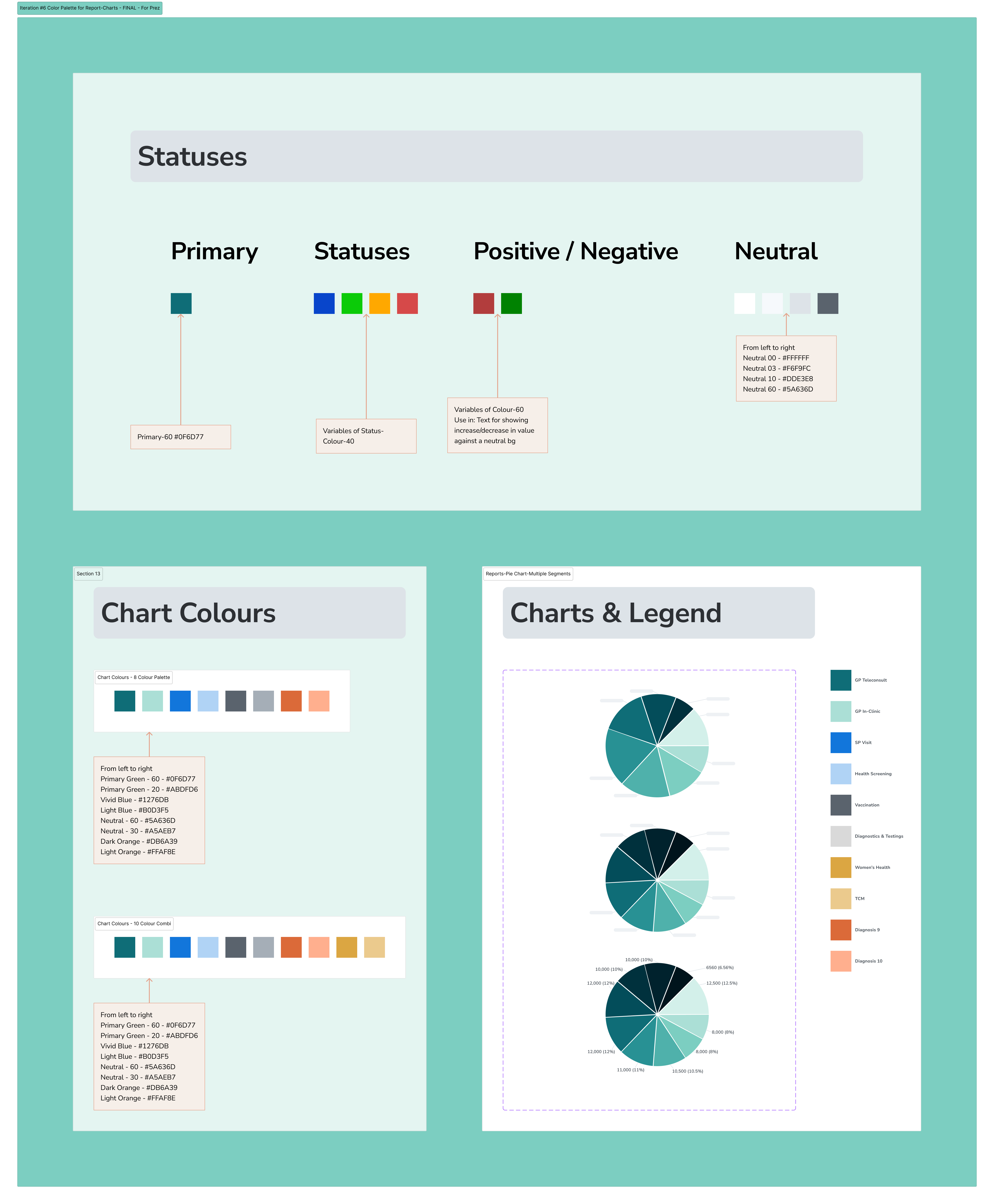
Vibrant colours for data distinctiveness
Colours had to differentiate data series at a glance, not just look coherent. Six palette iterations before a system that satisfied both.
Power BI compatibility as a hard constraint
Every colour and chart type was evaluated against Power BI’s rendering limits. Several Figma-first decisions were reworked to be technically feasible.
Prototypes as the sales artifact
High-fidelity prototypes, not wireframes — sales needed something to demo to B2B clients. The design had to work as product and pitch simultaneously.
The data pays
annual commercial value identified from the B2B HR analytics line, validated through client prospecting
dashboard designs in active use by the sales team for client demos and prospecting
high-fidelity prototypes used directly for development and sales — no extra design handoff layer
Reflection
Adoption and revenue are the same job, seen from two ends. The experience creates the data; the data justifies the experience.