04 — HR ANALYTICS DASHBOARD · MAY–AUG 2024 · ENTERPRISE SAAS · DATA VIZ
One visual language across HR, stakeholders, and disjointed data stories
Role
Lead Product Designer & Researcher
Team
Cross-functional — Product, Engineering, Data
Timeline
May – Aug 2024
HR teams and senior stakeholders were working from disconnected data sources — no shared view, no common visual language, no way to make a case for wellness investment with hard numbers. I designed a unified analytics dashboard across three sections that the sales team now uses for B2B client prospecting, with a cross-tool design system that bridges Figma and Power BI.
WHAT I DID
Conducted end-to-end competitive research across HR analytics platforms to map feature gaps and visual conventions, informing both product scope and design direction.
Ran UX research with HR stakeholders to understand how they actually read data — which led to a segmented dashboard structure (Benefits / Health Report / Wellness Zone) rather than a single aggregate view.
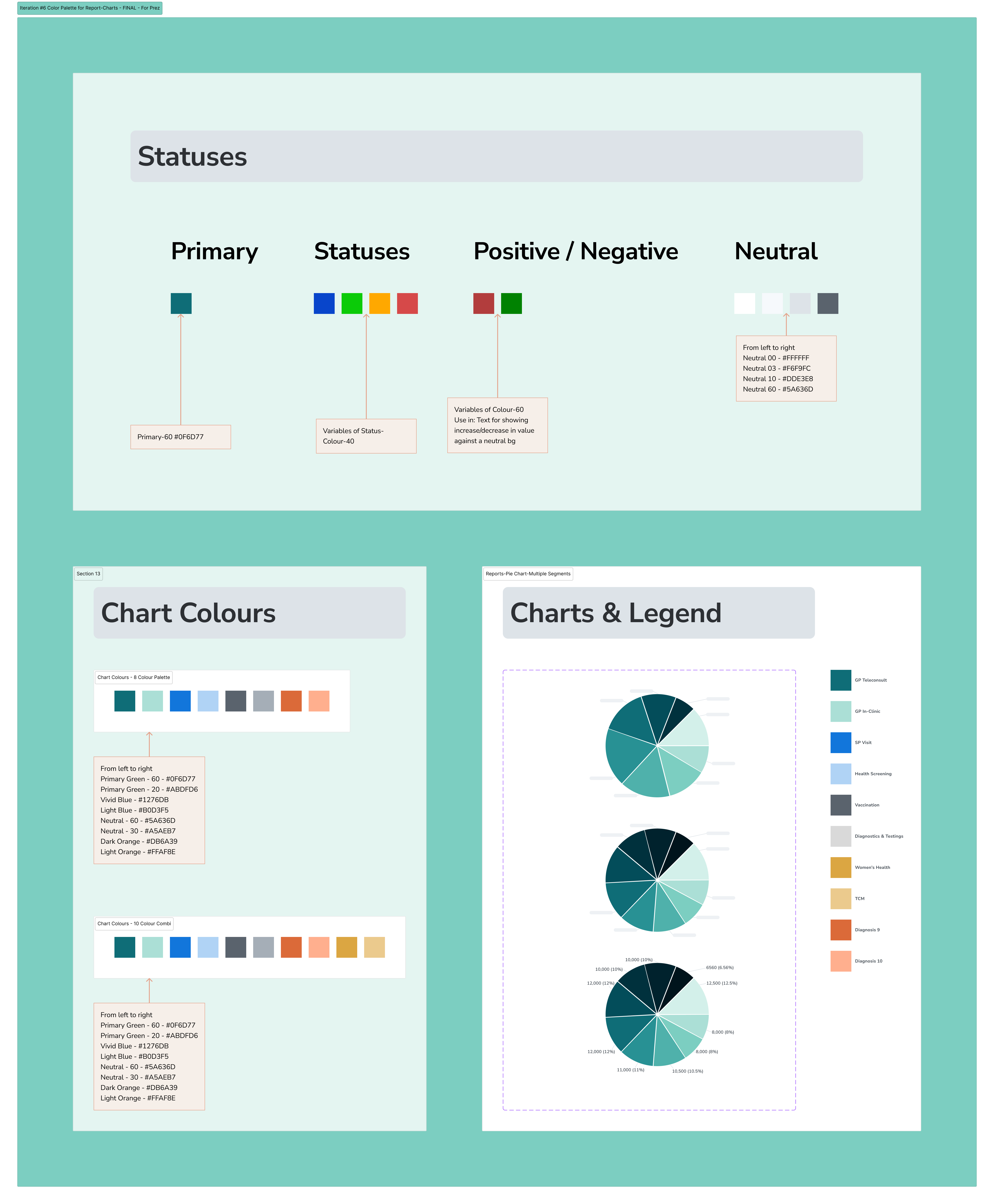
Owned the full Figma design: information architecture, component system, color palette iteration, and data visualisation references across 6 rounds of color iteration before landing on the final system.
Solved the cross-tool design system problem — aligning Figma tokens (color, typography, scale) with Power BI's rendering constraints, so embedded charts looked native to the Figma prototypes.
Produced high-fidelity prototypes used directly by the B2B sales team for client prospecting and Phase 1 product development, with no additional design handoff layer.
Facilitated collaborative design critique sessions with Product, Engineering, and Data teams to stress-test both visual decisions and technical feasibility.
THE CHALLENGE
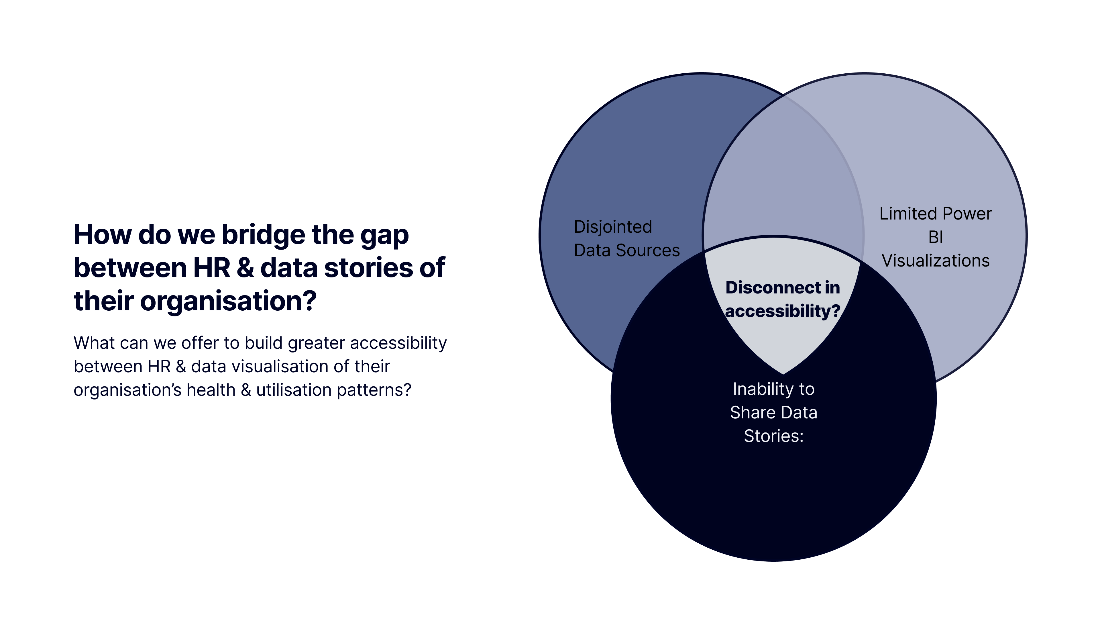
How do we bridge the gap between HR, stakeholders, and disjointed data stories about their organisation?
HR teams had data spread across multiple systems with no unified view. Stakeholders were making wellness program decisions without reliable engagement data. The product needed to work both as an internal analytics tool and as a B2B sales demonstration — two audiences with different needs from the same interface. An additional constraint: the data visualisation layer lived in Power BI, not Figma, creating a cross-tool design system challenge that most design processes don't plan for.
WHAT WAS BUILT — THREE DASHBOARD SECTIONS
Benefits Plan
Four views: At a Glance, By Segment, Trend Comparison, and By Time Period. Designed to answer the questions HR actually asks — not to surface all the data at once.
Health Report
Visualises employee health metrics (BMI, blood pressure, fasting glucose) across departments, age groups, and corporate plans. Supports data-driven wellness planning and targeted health interventions.
Wellness Zone
Tracks participation in wellness activities and points redemption patterns. Identifies engagement trends across programs and demographics to inform campaign design.
KEY DESIGN DECISIONS
Vibrant colors for data distinctiveness
Product-Design alignment: colors needed to differentiate data series clearly at a glance, not just look aesthetically coherent. We ran 6 palette iterations before landing on a system that satisfied both requirements.
Power BI compatibility as a hard constraint
Engineering and Data teams evaluated every color and chart type against Power BI's rendering limitations and embedded chart constraints. Several Figma-first decisions were reworked to be technically feasible.
Prototypes as the sales artifact
The decision to build high-fidelity prototypes rather than wireframes came from a business need: sales needed something they could demo to B2B clients. The design had to work as a product and as a pitch tool simultaneously.
OUTCOMES
annual commercial value identified from B2B HR analytics product line, validated through client prospecting sessions
high-fidelity Figma prototypes used directly for product development and sales — no additional design handoff layer required
dashboard designs are in active use by the sales team for client demos and prospecting